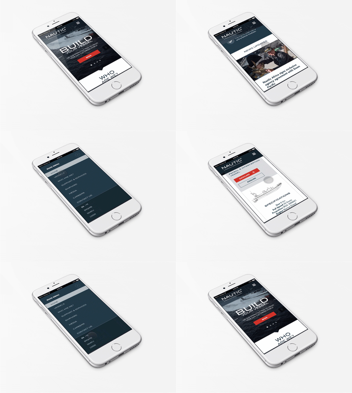
When it is all about the smaller devices first, why not target them first? Mobile First is all about making sites and user interfaces mobile-friendly.
As simple as it sounds, the mobile-first approach is a web designing concept. It is the best responsive or adaptive design approach.
It targets the smaller screens first and the wider and larger ones later in order.
Why Mobile First?
In and after 2015, the searches coming from mobile have out shadowed the desktop ones by a majority, globally. This has made Google change its priority in indexing.
Now, the Google algorithms index the mobile sites first over the desktop ones. The whole idea is about indexing the mobile-friendly sites for a better end-user experience.
With mobile sites stealing the limelight from the desktop sites, this responsive design trend is ruling the web design market.
This principle of designing websites is changing the world of website development fundamentally.
The designers create markups and designs, keeping mobile devices in mind. In a nutshell, it is just the opposite of the standard approach.
Bootstrap
Bootstrap is a framework that helps you achieve the mobile-first and responsive design approach with ease. It provides assets that help designers achieve this modern approach.
It comes up with assets, CSS classes, and JavaScripts for creating designs for mobile, desktop, and tablets.
Benefits of Following The Mobile-First Design
- Better user experience
- Improved visibility and reach
- Valuable
- Cost-effective
- Easy navigation
- Content-driven and oriented
Empowering The User Experience
User experience remains the topmost aspect of every business site. If you focus on delivering a great user experience, you can improve and retain your customer loyalty.
Mobile-first approach ensures to empower your business with great user experience.
Mobile Animation
Aren’t Mobile animations fading away? Also, designers are quite shying away from integrating animations in mobile sites. But the movement to include animations in designs is on the rise.
Animations and videos are a challenging task for iPhones as these do not render well. While for some, you might come across scrolling issues.
Remember, most of your website visitors are from mobile devices. Henceforth, animation designs should be from a mobile perspective.
The Future of Mobile-First Approach
The internet is a hub to billions of mobile users, and the internet family is growing at a tremendous rate. This growth is inversely proportional to the number of desktop users.
Now, website development has to be compatible with mobile-friendly designs. In order to exist in the internet-driven world, businesses need to focus on creating mobile-first designs for their websites primarily.
The consumers have become mobile, i.e., they have quickly adapted the “on-the-go” lifestyle. They check and reply to emails and messages on the go.
Even the growth of mobile manufacturers and the improvement of mobile networks symbolize the way mobiles are used.
Therefore, you should never miss out any opportunity to communicate with your audience in any form.


