The world of web designing offers a wide spectrum of colors. How about playing with 16.8 million colors? Yes, designers and developers can leverage around 16.8 million colors to design a vibrant site.
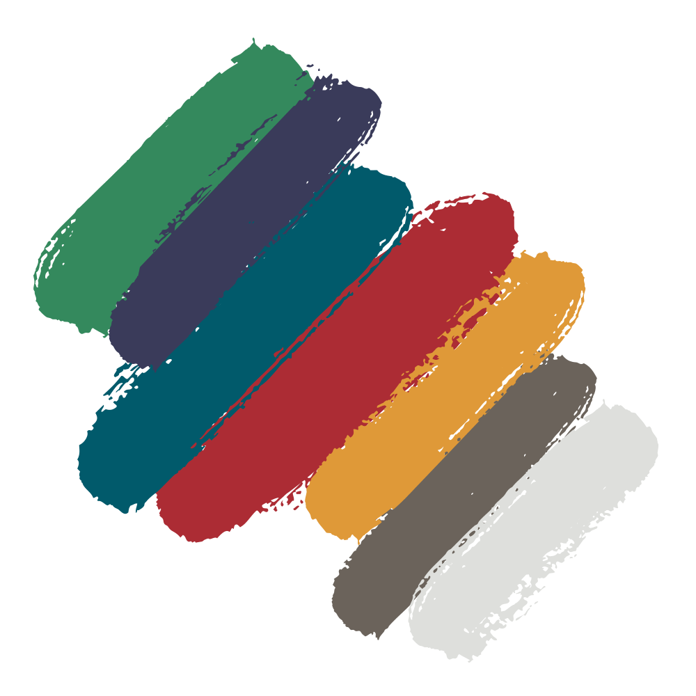
They can also experiment with the combination of diverse colors to form a palette. Moreover, the pool of choices becomes infinite.
One can improve the skills of color usage and combination. But this will not happen unless and until one dives deep into the world of colors.
1. Monochromatic and Absence of Color:
When we hear monochrome, we bring flexibility to the scope of web designing. It broadens the scope and arena of using just one color.
Ultimately, this can help in enhancing brand visibility and values.
How about choosing just one color on your website instead of using more than two to five colors? Sounds stupendous, right? This is hassle-free and can add aesthetic to your website.
This also engages more visitors and viewers to your site. Just using the right color and everything gets in its place.
2019 is also about minimal colors or no colors. You can also step further by eliminating color to simplify your color palette.
In design and art, colors like white, black and gray are referred to as neutrals.
2. Vibrant Color Palettes:
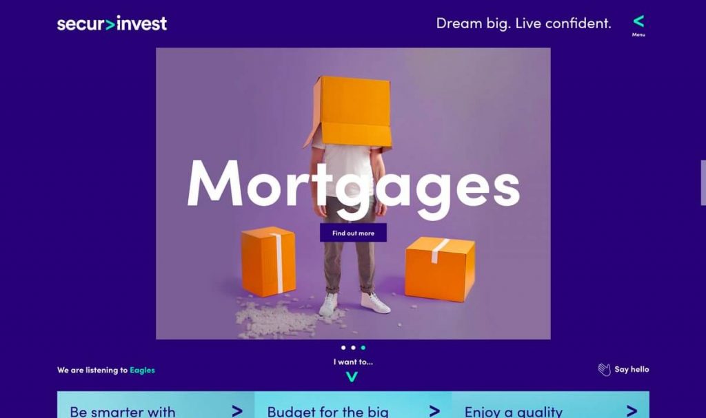
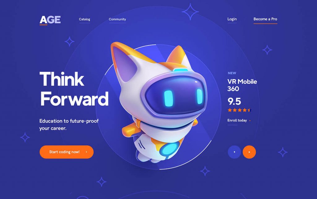
Bright colors are omnipresent. Every website now follows the bright and vibrant color choices for a visually appealing effect. Bright colors and palettes gained popularity with the use of flat designs.
They have gone through a major transformation along with the ever-changing design trends. They also give a dramatic effect with the material designs, and now we also see a tint of neon in some of the hues.
The fascinating thing about this web design trend is that once you have the right color or palette, it is easy to deploy. You do not have to go through the hassle process of redesigning your site from scratch.
This year go the unusual way with the vibrant color choices of palettes and be the trend.
3. More Gradients:
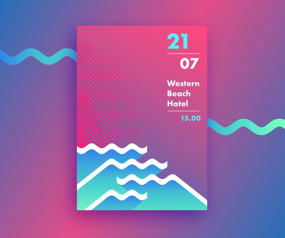
Gradients are flawless and can go well with any art or design. It is a trend that promotes usage of multipurpose colors which is just the opposite of monochrome.
The best thing about using more gradients is to pair them with multiple primary colors.
Gradient backgrounds are perfect for highlighting a specific message or content. They can even break out particular elements on the page or frame.
Moreover, they have the power to add a punch of color to any design or pattern.
4. Opposite Approaches to Color:
The trend is here to see such bolder and stronger colors. This year is going to be more about seeing the rise of saturated, bolder and opinionated colors.
Big and notable brands and companies are walking towards such palettes and color schemes.
5. Color Channels:
2019 is all about experimenting and diving deep into the world of colors. To achieve outstanding results, you can start working with color channels.
